Targets set by my tutor and myself for future projects:
- Read through work
- Grammar , on my last project my tutor pointed out the amount of lower case "i"'s there were I had obviously been rushing my work and not thought about the grammar as I can pick up marks on this too
I hope to meet these targets in the rest of my time on this course.

Tuesday, 30 April 2013
NCI 454 Typographical & Editorial Design - Final Design

Really pleased with outcome of my magazine spread , using my new found knowledge of Indesign I was able to manipulate the imagery into triangles creating a geometric feel to my spread. This module has definitely enhance my knowledge of editorial design and equipped me for future projects that I need to use Indesign for.
Editorial design is definitely something im interested in pursing in the future along with Art Direction , I enjoyed arranging where all the elements would go with the article and most of the imagery.
Although I was pleased with my final design , the mark came back and I had only achieved 54% which was above average but I feel I could have done a lot better. After having a chat with my tutor it became clear what let me down. My research was really short and was supposed to be 4 days worth of work. My tutor said my spread lacked weighting in parts and was very safe , I had to agree with him now I look back I could have done something with the page numbers as I just left them bare which is something my tutor picked up on. I intend to take these comments on board and try to challenge myself on the next module push myself outside my comfort zone and begin to think of original ways arranging type and imagery.
TARGET SET : Spend more time on annotation , read through work , research weighting
NCI 454 Typographical & Editorial Design - Inspiration


Whilst looking through my bedroom , I found an old Crack Magazine I picked up on the way out of a club in London. I loved the editorial design and was inspired by there layouts. Using simplistic design and slab typefaces Crack managed to portray a house style throughout the whole magazine.
As I have picked the Entertainment Brief , I thought this would be relevant as I wish to create a spread on a DJ or Artist alike Crack.
NCI 454 Typographical & Editorial Design - Grid Workshop
As we are learning about print layout , Nick thought it would be a good idea to start from the basics of the design process and start by designing our magazine spreads using the old fashioned way of pen and paper.
Using guidelines and particular dimensions for the gutters and margins , we began to draw our very first grid layout , using design code for body copy and imagery. Placing an 'X' inside anywhere that was going to be an image and lines for body copy. These were two very nice skills I picked up , as it saves you drawing the whole image out or even sketching it out and it also gives you an idea of where everything is going to go before you start designing on the computer. I really enjoyed this little workshop and challenged myself as I am not very good with measurements and calculation and felt it helped my way of thinking when it came to designing a layout.
Using guidelines and particular dimensions for the gutters and margins , we began to draw our very first grid layout , using design code for body copy and imagery. Placing an 'X' inside anywhere that was going to be an image and lines for body copy. These were two very nice skills I picked up , as it saves you drawing the whole image out or even sketching it out and it also gives you an idea of where everything is going to go before you start designing on the computer. I really enjoyed this little workshop and challenged myself as I am not very good with measurements and calculation and felt it helped my way of thinking when it came to designing a layout.
NCI 454 Typographical & Editorial Design - Research Task 1 & 2
Swot -
Strengths - Fair knowledge of Indesign from previous modules , Understanding of tools inside InDesign e.g pen tool , place holder. Good understanding of current trends in the editorial subject
Weaknesses - Type Formation , lack skills to produce a typeface
Opportunities - Gain experience in the editorial subject , be able to produce a piece of print to a professional standard . Learn grid layouts and different techniques in InDesign
Threats - Not fully annotating my workflow as I tend to rush this process.


New Module - NCI 454 Typographical & Editorial Design
Really looking forward to this module , Ive always loved editorial design and wondered how such great effects can be achieved using InDesign.
After attending some InDesign Tutorials with Nick , I learnt a hell of a lot about the tools and techniques in the programme. Unfortunately I did not take any screen shots , I was far too interested and caught up in getting to grips with all the tools in Indesign. However I can tell you what I didn't know how to do before and what I know now.
 1) I now know how to wrap text around an object using the direct selection tool to curve the place holder text around the image. Which is something thats always baffled me when flicking through magazines.
2) Setting up a document InDesign inputting in the correct margins and gutters
3) Inserting placeholder text to make up for body copy
4) Place holder cropping , focussing on a focal point of an image
I was know fully equipped with the knowledge to start creating my own editorial spread.
After attending some InDesign Tutorials with Nick , I learnt a hell of a lot about the tools and techniques in the programme. Unfortunately I did not take any screen shots , I was far too interested and caught up in getting to grips with all the tools in Indesign. However I can tell you what I didn't know how to do before and what I know now.

2) Setting up a document InDesign inputting in the correct margins and gutters
3) Inserting placeholder text to make up for body copy
4) Place holder cropping , focussing on a focal point of an image
I was know fully equipped with the knowledge to start creating my own editorial spread.
NCI410 Digital Skills Acquisition Graphics - Final Designs

After finalising my design , I decided to run with this design for my final design as I feel it best represents my self as a brand . Adding the glow on the type and lines coming out of my head I thought really emphasised innovation and idea generation which best met my brand qualities. I really enjoyed this module and feel like I have improved my skills in Photoshop using the layer palette to overlay images. It gave me a chance to make all the decisions although tricky at times , I enjoyed the freedom to personally represent yourself .

I really liked the colour and execution of layering on this design , however for me the logo did not fit comfortably in the centre after gaining feedback from some of my tutors they felt the same so I decided not to hand this one in as my final design although I really liked the concept.

I decided to pick this logo for my final outcome , further images in my blog show me using a script logo manipulated from my own signature , however after gaining feedback from one of my tutors the script format did not work with my geometric style I wanted to portray . So I managed to combine the two initials of my name into a square shape , I was really happy with this design and will most likely use this for my freelance work on business cards and my website.
This module has really opened up my eyes to new skills and techniques in both Photoshop and Illustrator , I feel I have improved and am now able to build on these skills and adopt a faster way of working.
NCI410 Digital Skills Acquisition Graphics - Photo Development


Once I was happy with my photographs , I began to import shapes from Illustrator I had created - playing around with the layout and my tag line. The tag line 'Always Thinking' I feel best represents myself and the design of the poster. The lines coming out my head represent thought and innovation two words I held onto from the Workshop earlier in the module this meeting my brands qualities. These are two things I wanted to get across that I am always thinking of new ideas , new trends and forms within my design process.
NCI410 Digital Skills Acquisition Graphics - Photographs From My Own Camera


After learning some new Techniques in the Digital Skills workshop with Paul about different layering techniques in Photoshop , something which I thought I already knew!. It was really helpful and gave me the ability to think about my photographs in a different light. We learnt about how to screen images over the top another image and how to achieve textures over the photograph by just placing an image over the top and using a desired function in the layers palette. So I decided to bring these new skills to use , after taking some of my own photos I edited them using some light leaks I found from a Lomotography collection online , I loved the way these light leaks looked over the top of my images it gave them that effect I was looking for all along - that over exposed , colour blotches and washed out look that was present in some of the photographs I looked at for my inspiration. As I was so pleased with how these photographs turned out I began to think about my logo and other detail that would appear on my poster.
NCI410 Digital Skills Acquisition Graphics - Photos From Shoot


This is the final outcome of the photography shoot I directed , I really like the effect however I dont think it looks symmetrical and some of the layers on photograph tend to overlap a little more than I had liked. I tried to recreate the effect Johnson & Drake did on there Look Book for Forty Ounce but my mistake was that I did not ask the photographer to take a few normal full length shots of myself not using the exposure effect on the camera. As then I would have been able to edit and position the layers myself and play around with different embedding techniques learnt in my Digital Skills Workshop with Paul. On the other hand it was really cool being able to choose the style of my photographs and portray exactly what I want but I have decided to take some more photos of myself using my own camera that better meet my brand qualities.


Art Direction - NCI410 Digital Skills Acquisition Graphics
As we are required to step into an Art Directors role in this module , I thought it would be worth while looking at some Art Direction work through the Behance Network. Only to stumble upon the designers behind the Outlook 2013 rebrand , I had loved the artwork for the Outlook festival as soon as I saw the poster and wondered who was behind it all , well to my discovery it was by an agency called Two Time Elliot based in Nottingham . Having a browse through there work really gave me an idea of the execution and quality of work produced by agency directors , everything from the photography to the type layout is accessed and thought out throughly ensuring a beautiful outcome. Take a look at some of Two Times Elliot's work for Outlook 2013 below.
Check out more of there work here


Check out more of there work here


I love the execution of the typography on these posters , the large letters are placed almost randomly across the page . With lovely images of the festival inside the letters placed perfectly and really giving the feel of the festival . The colour works beautifully with the white type and editing on the photographs. Placement of type has really been thought out here , I love the way they have used the shapes of the letters of the festival to execute nice looking shapes with a geometric feel and simplicity at heart.
Monday, 29 April 2013
NCI410 Digital Skills Acquisition Graphics

In a class workshop we were given a number of subheadings in which we had to pick 5 words that represented them e.g type of car or even a celebrity we admired. For each we were asked to pick 6 words from the above object that we felt most represented ourselves. I 6 words I picked are pictured above , all of these words I felt helped me put into perspective my brand and what I wanted to represent when designing my promotional material. Overall this exercise was really helpful in gaining idea's for my brand and how I want people to perceive my brand.
NCI410 Digital Skills Acquisition Graphics
After a talk in class about the standard and structure for submission , It gave me a much clearer idea of what the module guide is asking for and the standard of work that is expected from us. Having a look at a former students hand in , I decided to adopt this style of working and raise the standard of my work through presentation on InDesign.
I was really excited about starting this module as it allowed us to collaborate with photographers to produce a piece of promotional material for ourselves , not only giving us the opportunity to use different techniques but also the freedom we have in producing a brand identity for ourselves.
I also decided it was time to create a Pinterest account to help me with my research along the course
Check out my profile here

NCI453 Branding & Corporate Image - Final Designs
Final Designs For The School Of Creative Industries :


I felt this module was really helpful in gaining an insight into stationary design for corporate identity's . I learnt how to successfully execute a piece of stationary and a brand identity. After much deliberation over my logo for creative industries I decided to go back to some of my previous sketches done in my scrap book . I learnt that it is essential to keep all your work as your first idea will not always work out , which is exactly what happened here , I was not happy with my first couple of ideas so I went back and found light in something I had recently dismissed. I am really happy with the outcome and the standard of my work in this module , I feel I have adopted the necessary skills In Indesign to produce a range of different stationary using grid lines and rulers to execute the alignment. From this I can now use these skills in further projects that require print and other techniques .
NCI453 Branding & Corporate Image
Whilst coming up for ideas for the Corporate Identity of The School Of Creative Industries we were introduced to InDesign , which as I have found is great programme for print and finalising the finished product. As the final outcome of this module was to create a set of stationary for the brand , attending the workshop on InDesign really helped me understand layouts and alignment of Letterheads , compliment slips and basic print material.
Throughout the workshop we learnt a variety of different tools to support our finished product. Including the process of inserting an image into Indesign and positioning it correctly using place holders and ruler guides to align the document.
Having learnt these skills , I decided to put my knowledge to the test and begin to create and manifest my final outcome.
Here are a few screen shots of the process of the formation of my logo for SOCI :


After showing some of my tutors the designs I had created , I gained some good feedback however I still felt there was a solution that had to be found . My tutor said the logo needed to be more aligned and that the two lines were not signifying a lot. So i decided to go back to square one and take on board the feedback I had received.
Live Brief - Newcastle Music Hub
Logo Task 1 – Live Brief
Brief : Design a logo for Newcastle Music Hub.
Background :
Newcastle Music Hub is a new initiative that is aimed at students from school age to 16. The music hub will work in schools and local colleges to inspire students to get
involved in music workshops short courses. It involves all aspects of music from
singing, playing instruments, making records, dj’s etc.
Newcastle Music Hub needs a logo that will be easily recognizable and have some
element that reflects music.
As this was a short two-day brief we were asked to get started straight away , unfortunately all my research was documented in my sketchbook which contained various research about the target market and relevant research into the topics surrounding Newcastle Music Hub.
I began to disect the brief and ask myself to think outside the box instead of creating a generic logo with the obvious music notes , headphones or a musical instrument. I decided to focus on the word 'Hub' to me hub portrays a scientific aspect , a centre for communication that is available to everyone . I wanted to portray this aspect in my design so began to formulate some of my idea's in my sketchbook on to the computer.
At first i began to experiment with different typefaces and solutions to creating the Hub idea , The first shape that came to mind when thinking of a Hub was a circle but also the connection of a Hub. So i experimented with different placements of circles to adopt the notion of connection of a Hub. However I felt some of my ideas were too corprate for my target market of the school age to 16 years old.

So decided to take a softer approach and run with the idea of just using a typeface combined with a circular shape or modified slightly.

I particularly liked the logo with a drop shadow using a softer font to connect with the target market and respond to current trends learnt in the presentation earlier in the module. After deciding on this design , I began to experiment with colours using a soft colour palette that would stand out to the target market . I feel this design would also be appropriate if the company decided to produce other promotional material such as merchandise .

NCI453 Branding & Corporate Image - Introduction to Illustrator (CAD)
First workshop of module was an introduction to Adobe Illustrator , although i felt comfortable in illustrator in parts I still lacked various knowledge about particular tools in the programme. This workshop really helped me gain a better idea of the pathfinder and a variety of different effect I can apply to an object or image. As Paul began to run through the basics I found a knew a lot more than I thought I did , the way the workshop was run was really helpfull as we encourage to decontruct pieces of work and ask the question 'how was that done?' in order to learn about the specific tools needed to create these effects.
Here are a couple of screen shots from the workshop :
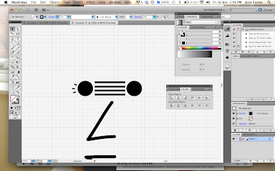

Here are a couple of screen shots from the workshop :
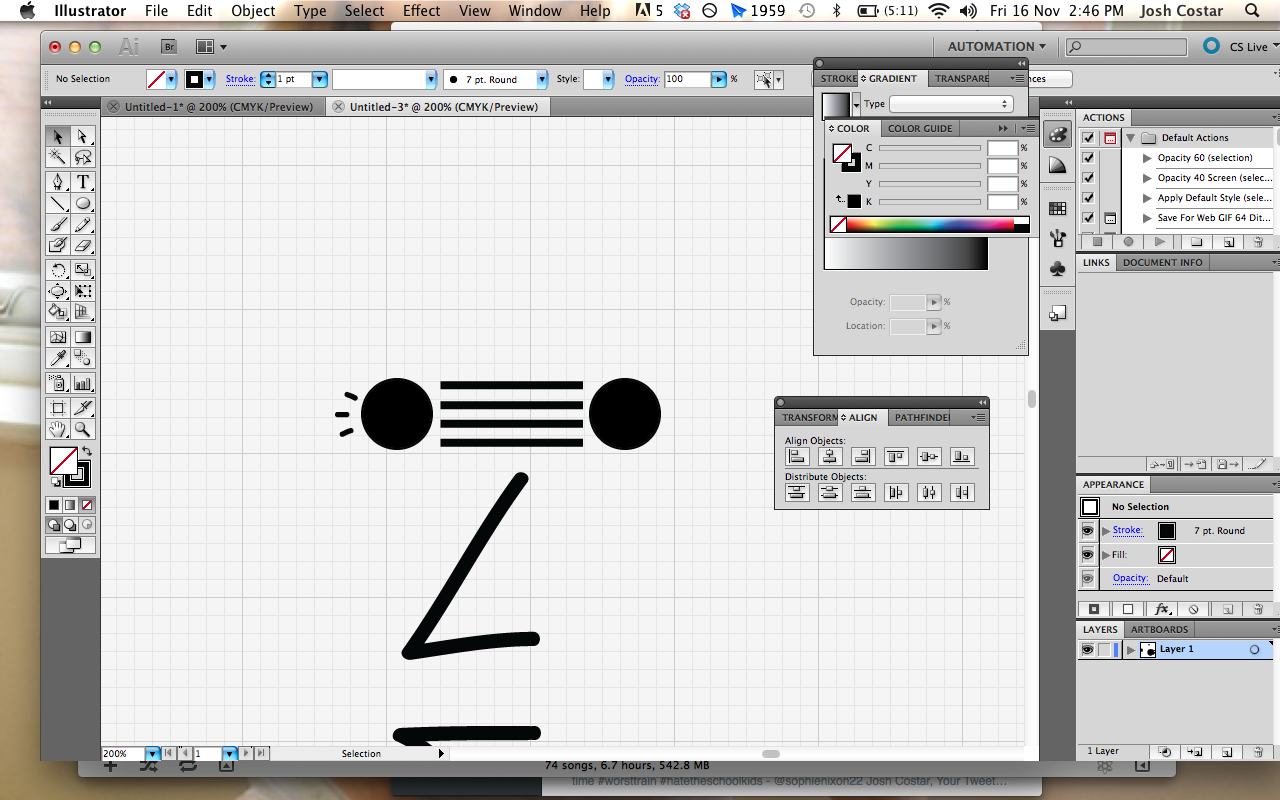

I applied a range of effects using the twirl and blend tools in illustrator to manipulate a circle and create a little illustration of a face using the pen tool . This has helped me gain a better idea of the tools inside illustrator which I can apply to when I come to design my corporate identity .
NCI453 Branding & Corporate Image
In class we were given a number of presentations on the formation of brands and what makes a good brand a successful logo . But also the price of a logo and the process of idea generation.
We were shown this really helpful article from the Creative Bloq , check it out here
This helped me understand about the processes in which every designer goes through when designing for a client to formulate a brand identity. Some of the main points the article covered was:
- Strategise From The Start
- Do Your Research
- Work With A Brief
- Check The Competition
- Dont Ignore The Client
- Exercise Contraints
I found these pointers really helpful , all of them are just as important as each other however a couple of points really stood out in which I thought was crucial when designing for a brand especially ' Do your research' and 'check the competition' both these points illustrate the fact of how important it is to carry out research and check whats already out there before you even begin starting to design. But also 'Work with a brief' I feel is extremely important as there is nothing worse than straying away from a brief giving the client something they did not ask for would be a nightmare if they have paid you all that money for them to chuck it back in your face.
NCI453 Branding & Corporate Image
Logo Trends Presentation
We were shown a presentation about the current design trends that are circulating the creative sector at the moment , I hand picked a few slides from the presentation :
Gradients

Monoline

Banded

We were shown a presentation about the current design trends that are circulating the creative sector at the moment , I hand picked a few slides from the presentation :
Gradients

Monoline

Banded

This helped me gain a better idea of what sort of trends and design aesletics are present in corporate identities and brands at the moment , This also helped me when thinking idea's for my own logo and the current trends out there which I may want to follow.
NCI453 Branding & Corporate Image
Our first assignment / task of this module was to produce a branded alphabet , depicting brand logos as each letter of the alphabet to illustrate how many different brands there were. To which in class we would guess each one to see if people would recognise the first letter of the brands logo or identity.
This was my final outcome for this task :

This was my final outcome for this task :

I chose to pick brands that appealed to me but also logos that I admired and thought were well executed. I went for the simplistic option on just black and white , using smart guides I was able to keep each letter in line with one another and centre the whole image. I was pleased with the outcome and enjoyed finding relevant logos to place in my poster.
NCI453 Branding & Corporate Image
Logorama - Short Film
Logorama is a 16-minute French animated film written and directed by François Alaux, Hervé de Crécy and Ludovic Houplain, and produced by Autour de Minuit. The film depicts events in a stylized Los Angeles, and is told entirely through the use of more than 2,500 contemporary logos.
After watching this short film , it really put things in perspective of how important branding is for a company and how it is almost impossible to escape brand identities , they are literally everywhere.
NCI453 Branding & Corporate Image
We began to research and document various other brands identities and how they form this identity but also finding out what actually is a brand , we were asked to complete a series of tasks to help grow knowledge on this subject.
We were then asked reflect and annotate some corporate identities that appealed to us :

1. What is a brand?
A brand is a "name , term , design or symbol" which identifies a sellers goods or services which evokes particular feelings and views about the company's concept , this is used to differentiate themselves from other sellers .
2. Why do we have brands?
Brands exist to inform us of the company's identify , they are designed to distinctively set them apart from other sellers in the market . Without brands the company's identity would not be apparent and therefore the company would not be recognisable and unable to market their products. Being a customer we associate different brands with different products without this mark , the company' would not be able to generate customer loyalty or brand recognition.
3. What is the purpose/job of a brand?
The purpose of a brand is impose a sales pitch or create a concept around the products they are selling in a particular market , a brand identifies a company in its market and helps the company grow.
4. What are target markets?
Target markets are segments within the global market that share a particular attribute such as age/gender or opinion. A brand will identify its target market in the development process of a project and will come up with a marketing strategy on how there are going to capture there selected target market.
5. What is the difference between a brand and a logo?
The brand is the concept behind the company which co-insides with the logo and gives the brand an identity that can be recognised and marketed.
6. What is a brand characteristic?
A brand characteristic is a style represented in most importantly the logo and the company's products or services , they will all be designed with the logo in mind creating a house style for the brand and overall developing a brand characteristic that is recognisable among other brands.
7. What is a brand extension?
A brand extension is an established brand name on new products in a different category or sector . A company using brand extension hopes to leverage its existing customer base and brand loyalty to increase its profits with a new product offering.
8. What is a brand slogan/ strap line?
A brand slogan is a catch line or sentence identity a brands motive and selling point , Slogans are an important element for a brand because it helps increase costumers retention rate and desire for a brand.
9. What is the position of a brand?
Brand positioning is a strategic approach to establishing a sustainable competitive advantage over other brands in the same market segment. In this case a brand logo will help identify and increase the competitiveness of there brand if there logo is well designed and engineered for the correct purpose.
We were then asked reflect and annotate some corporate identities that appealed to us :

NCI453 Branding & Corporate Image
SWOT Analysis
Strengths - This being the first module of my course I feel I have a range of different strengths to help me start this module. Before signing on to this course I have gained some experience in liaising with a client whilst working as a freelance graphic designer throughout the holidays whereby I had to rebrand a shopfront and its promotional material.
Weaknesses - Lack of knowledge on professional standards of working e.g how to present and display my work to the client. Dimensions and particular printing options such as working in RGB and CYMK. Also lack knowledge in programmes such as Indesign and various tools in illustrator.
Opportunities - This module will give me another opportunity to produce and gain experience in working with a client to produce a brand image and corporate identity. It will help me gain a better idea of the workflow of carrying out a task such as this one and what processes are involved.
Threats - Time scale , keeping focussed outside of studies as well as the two days we are in college. Being able to produce something that is fit for purpose and meets the briefs guidelines.
Tuesday, 9 April 2013
First Customer
So i finally got round to putting my inspirational posters up online for people to buy , I have asked in return for every customer to post me a photo back of there poster up on the wall and tag me in the photo so it can be seen on my official Facebook page.

Wednesday, 3 April 2013
Smooth Groove Commission
I was asked by a friend of mine to help out in filming a viral video for a new product for Armchair Media. The video will be shown on the Crowd Funding website letting users or potential investors get a better feel for the product.
It gave me another insight into art direction and liaising with different people from different disciplines wether a client or a friend.


It gave me another insight into art direction and liaising with different people from different disciplines wether a client or a friend.
Subscribe to:
Posts (Atom)