Friday 13 December 2013

Action Plan

Goals

Intention – What is it you want to achieve?

I want to get a job working in a fashion and music based environment, I see this as working as a editorial designer for a magazine or working for a clothing brand or starting my own.

Specific –

I would like to be working ideally in a city , London , Manchester etc
However a job would need to be secured before hand to cover the costs of living.

Measurable –

I need to specialize myself in fashion design or editorial.

Attainable –

Learning more skills to do with editorial such as grid systems , layouts and typography.

Sending out CV’s to all relevant magazines such as I-D Mag, Trap Mag , Crack Magazine , Rough Trade , Daily Street and other design agencies in the south.

Relevant –  is it important to what you want to achieve ultimately?

I feel that this goal is achievable with the right positivity and determination that has got me through he past 3 years.


Time Based – January look for summer internships , jobs – opportunities.

Tuesday 10 December 2013

CI563 Packaging Design - Final Outcomes


After setting up my template in the required format for the laser cutter , just an hour later my nets came off the press. I chose to use Yellow and turqoise card 200gsm as it was thick 
and durable. However if I had more time I would have liked to have sourced something abit more glossy or a matt finish to give it that extra touch and sense of feel when the customer opens it. 

I was somewhat happy with the detail of the laser cut , the net fit together perfectly and I really liked the shape. However the laser cutter seemed to have left burn marks around the type and on the strip around the brief shape. This might have been due to the card I used , I was told that it is hard to avoid these burns and the only other way would be to manually scalpel the lettering out . I felt this option would have been time consuming and that I wouldnt achieve near the amount of accuracy than the laser cutter.  


I was really happy with how the brief shape turned out on the strip. However again the quality of paper I used wasn't exactly what I wanted. I found the strip to be a little bit flimsy and not thick enough. I still persisted with putting my box together as time was ticking and I was overall happy with the way it looked. 

If I had more time I would have liked to have sourced , tested and trailed a lot more materials . As in industry you will have a strict deadline that needs to be met which leaves no room for mistake and the idea process I have undergone . On the other hand this is just a prototype and there to show you how it will work and the functionality but also how it looks physically.


Friday 6 December 2013

Anna Lomax - Visual Artist

Just stumbled upon the works of Anna Lomax , whilst reading an article with the Lazy Oaf owner over on YCN . I love her series of work around the idea of Pure Filth created for Pick Me Up Selects. 


I love the old nostalgic 80's theme to the sculptures , the grid flooring combined with objects that defy the symetry and bend realities. The combination of inflatable objects with nature is something that really interests me. 

Exhibitions In Newcastle - Eduardo Palozzi

I plan to attend 'Eduardo Palozzi's Bunk!' Exhibition in Newcastle at the Hatton Gallery
on (25/01/2014 - 17/05/2014)

'Bunk! is a series of prints and collages which are mainly made from magazines given to the artist by American ex-servicemen. They show Paolozzi’s fascination with popular culture and technology, as well as with the glamour of American consumerism'

Eduardo Paolozzi's Bunk!

The series was created in 1972 and were seen as revolutionary. They are now regarded as one of the earliest examples of British pop art.

It seems like something I would be really interested in , Ive always loved old american consumerism and the culture that surrounded it. The fact that the artist's imagery was given to him by an American Ex- Servicemen suggests that work may relate to war time propaganda and elements of pop culture surrounding this time.


Monday 2 December 2013

Yeti Clothing - Freelance Work

I have just finished a design for yeti clothing , over the years I have built a strong relationship with the Yeti boys . Since 2011 I have designed every peice in there collection ranging from sweatshirts to T shirts. I love producing work for Yeti as it allows me to express myself creatively more. I was inspired by old retro ski themed shell suits and the abstract nature of the sport.


Nike Spirit Machine

Just finished reading a really interesting article about the nature and ethic behind Nikes collaborative design team. It consists of 3 members Nike chief executive Mark Parker, designer Tinker Hatfield and cultural consultant Hiroshi Fujiwara in which there aim is “to amplify new innovations, reinterpret existing designs, and explore concepts that take the brand to new places.”Check out the full article at Business Of Fashion 


Saturday 30 November 2013

CI563 Packaging Design - Development Continued ...


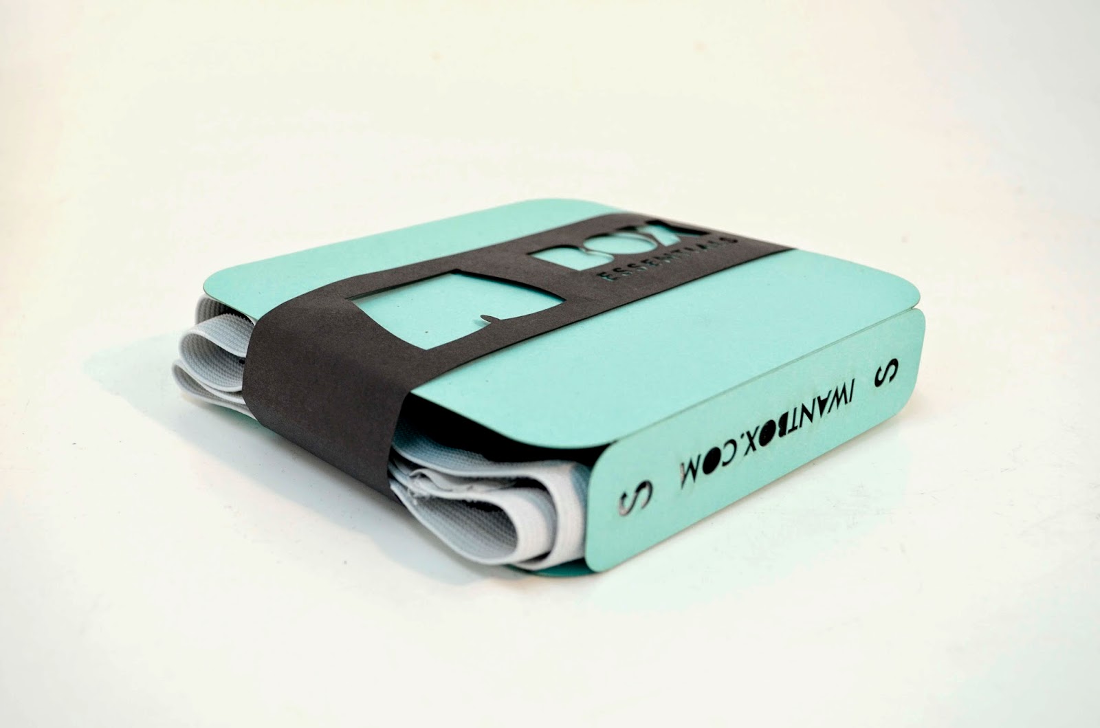
I drafted out a packaging net on card to see what the functionality of my design would be like. I found that by stripping down the sides I could install a slit on the left side to which the right tab could slide into and keep both the packaging and product in place. I wanted the spine of the box to be shorter than the face so its more like a casing rather than a box.

I have also decided to put the website and the sizing information on the spine of the box possibly as a die cut I am not sure yet. 

I was really pleased with the 
prototype and decided after much deliberation that this would be my final idea to execute and send to the laser cutting machine. But first I had to transfer and plan out my design within illustrator. 


Firstly, I needed to make sure I got the measurements right before I started to input them into illustrator. 
I decided to have my box 14cm by 14cm with a 3cm spine allowing the box to be mailed through a letter box. 

I used sharp corners for the scamp out as it helped me gauge the exact size of all the elements and made the process much quicker as I knew I could just use the rounded rectangle in illustrator to refine. 

Once I was happy with my measurements I began to input these measurements into illustrator using rulers & the transform tool to correctly position the shapes. This was a skill I had just learnt from a tutorial with my tutor. I was able to drag out the rulers to the corner of my rectangle and exactly measure where my shape was on X and Y axis. I was then able to snap the next object to my shape by selecting a position on the transform box to snap to. The transform tool also allowed me to click on any shape and input every measurement I had done on paper which was really effective , especially in industry where time would be valuable. 


As I started to create my vector 

objects I had to take into consideration the amount of detail the die cut would allow , so I tried to make them as simplified as I can. I started to thinkabout the rationality of the detail and wether it would make a big difference if it was just the shape of the product cut out or inner details e.g lines on boxers or ankles and toes on the socks. However to get this detail I would need to have inserted lines to hold the inner piece together making a sort of kids stencil look . Im going to experiment further with the strip with a bit of trial and error I should get somewhere.

I tried out a couple of light colours with the vectors on top , this gave me an idea of what my illustrations would look like with colour behind them and give me an idea of what type of stock and palette to use.


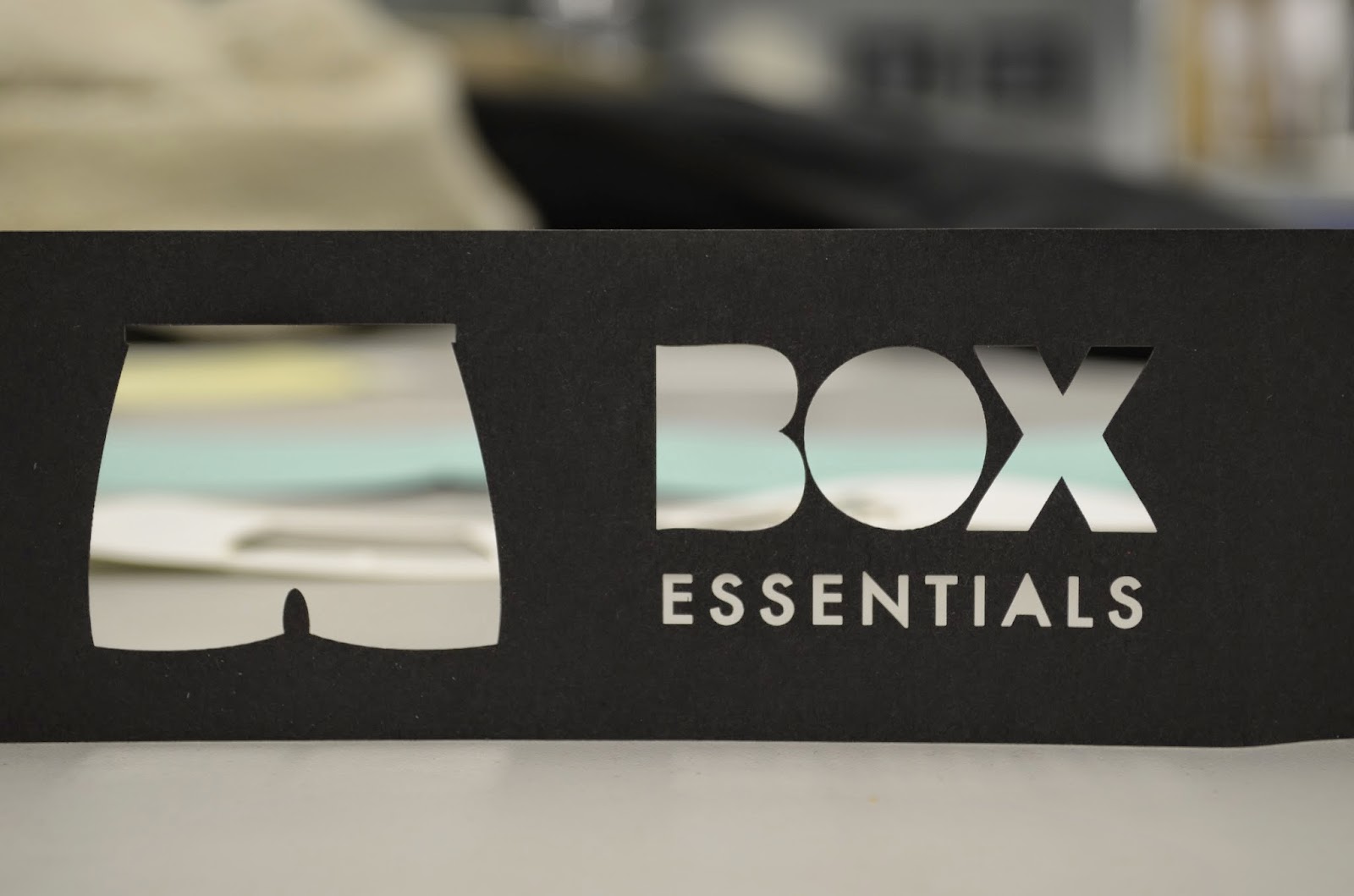
I wanted to experiment a little with the strip that was going to around the packaging. The lines in red will guide the laser cutter to what needs to be cut out. I create the end of the strip using the divide tool in path find er to subtract two circles from the corners to be left with a shape that curves out at the top which when placed into a slit will keep it in place.

Just to be sure I measured the entire legnth of the packaging net so the strip would fit around the box 
perfectly. 


I printed out my packaging net and the strip in a smaller specific just to get a feel for what my box was shaping up to be like and if any adjustments needed to be made before sending off to the laser cutter. 

On this particular net I had put any sizing on the spine and the word briefs was verticle which I dont think worked very well as it looked abit out of position. So I decided to scrap this , not have the word briefs on at all and let the symbol on the strip do the talking. In replace of this I decided to put the size above and below the website address on the spine to balance out the type. 


Friday 29 November 2013

Goals and thoughts for the future

So I have figured, I need to start thinking about what I want to do after the second year of my foundation degree at Newcastle College. At the moment I am unsure on what particular area of graphic design I want to specialise in. Since leaving compulsory education , I have managed to gain a hand full of freelance clients ranging from branding to fashion design which have really helped me build quite a strong portfolio.

At the moment I work as a graphic designer for Cosmic Ballroom , which has been voted best UK small club in the UK. Whilst working for Cosmic I have enjoyed designing and branding a variety of in-house nights for the club. I have been working for Cosmic for about 6 months now and really enjoying it but I feel i need to expand my horizons a little bit and look for other platforms to express myself creatively rather than flyers for club events.

So Im really into fashion and would love to go into some area of graphic design regarding this sector , Ive always been interested in clothing and despite the competitive market , I feel I could bring something new to already saturated market.

Even though I know nothing of putting together an actual garment Im keen to learn and would love to be a part of the process down to every little detail. It's really something that drives me , when I see a shirt or buy a piece of clothing , Im always nit picking on what could have been done better or how I would have done it. This drives my ambition to create my own clothing line , consisting of tailored garments with extra attention to detail and quality.

My Goals for this year are :

Look into fashion & graphic design internships
Practice and define my craft.
Maintain a healthy creative environment
Get out more , Network go to more events.


Wednesday 27 November 2013

CI563 Packaging Design - Development Continued ...


I went back to my note book and started over , I still really liked the idea of still using a die cut to 
represent the products and wanted to let the product spreak a little. 


I started out with a regaular box shape , on this would be die cut outline of the product with a strip running down the left occupying the white space. This strip would have all the details such as the logo , sizing and website. 

I again began to doubt this idea and the legibility of my illustrations if I was just going to show half of the product Would the customer really get what was inside straight away? . I wasn't entirely confident with this and felt more work needed to be done to make this work. 


I wanted to keep a the idea of 
having a strip running down the box so I decided it would be more 
effective to have the details on the strip rather than the actual box. 

I started to think of new ways to adjust the average box shape. 
Playing around with little paper 
prototypes to see what curves i could achieve with scissors. I came to the conclusion I wanted to have curved corners, I liked the idea of having a rounded box instead of sharp corners. It made it feel much more friendly and icon like.  The box would have a strip running horizontally around the contents. The detail on the strip would be done using a die cut , Im not sure wether I can achieve that much detail on the boxer shorts with a die cut but im going to have to experiment with that. I wanted the colour of the box to shine through the lettering and give it another 
dimension rather than just using printed type. 

Tuesday 26 November 2013

CI563 Packaging Design - Development Continued ...


My first idea was to have each box for a seperate product which would make up an overall box shape when faced flat . Each box would be exactly the same shape , taking inspiration from the way boxes are formulated using isometic grids. The product would be communicated via a die cut of an illustration of the product inside. I wanted to represent the products in the simplest form I could. 

I began to think about colours and what promoted masculinity I thought about having each box be a shade of the colour representing how the light would drop onto a box in real setting. 


I slowly began to worry about the functionality of this idea whilst getting too caughtt up working on isometic paper . I really liked the idea of all of the products forming together to create a box but I was unsure on a couple of things i.e

- how effective the visual of the die cut would be.

- The positioning of the logo / information on this shape , Would it be skewed or just in the centre?

- How the product would fit in?

I started feel like I was too held back and picked a really arkward shape to work with. 

Inspite of this I mocked up a visual using a draft net I drew . This gave me a much better idea of the outcome , I was still not conifdent on the shapes functionality , I think it would look great but it wouldnt jusitfy the product inside.

CI563 Packaging Design - Development


After our first briefing I began to create a mind map to help summarise the core values of what box wanted. 

I began to think about the limitations and contraints of the solution box were looking for and started to gain a general idea of there potential customers. Men who don't have enough time to shop online or simply don't like shopping and want a quick , easy and cost effective solution to purchasing undergarments. The fact the packaging has to fit through a standard letterbox is something I am really going to have to think out and solve.


Tuesday 19 November 2013

CI563 Packaging Design - Research into Good Packaging


I love the simplicity and the materials used to execute such innovative packaging. The functionality of the packaging is to keep the prodcuts intact. I love the way the packaging informs the product without having to say anything It enhances the organic and grown nature of the product.


The shelf presence of this packaging is strong and informs the consumer about both the product but gives them something to keep once the product has been opened which I think is really effective in this day in age as you dont get alot for free. It makes the product more valuable and quality driven just by its packaging. 


I like this idea as the products core form interacts with its packaging, helping the product stand out and give it narrative. Such a simple idea yet it works so effiecntly to reach its target audience. 


These simple illustrated boxes are really effective , instead of the regular display of the product they have chosen to illustrate the box and give it another dimension.


Johnny Cupcakes has been a long standing brand for over 4 years now, built upon the idea of marketing t shirts as bakery products hence the name cupcakes . He stretches this theme across all his packaging using cartons with handles for t shirts. This helps the customer get a piece of the brand but also doubles up as a souvenir.


Tuesday 12 November 2013

CI563 Packaging Design - SWOT Analysis

Strengths - Ability to produce vector illustrations from last module , literate in indesign and illustrator.

Weaknesses - Have not yet designed for a 3dimensional product, no experience in choosing stock or using and preparing for the laser cutting machine

Opportunities - As this is a live brief set by monogram london, I have the opportunity for my work to be picked and used for there mail outs.

Threats - The packaging has to fit through a letterbox and be relativity cheap to produce

Tuesday 22 October 2013

CI 533 Digital Applications Graphic Design - Instant Print - Final Designs / Feedback From Client


After showing the client my designs , she really liked the simplicity of my design and the detail of the vectors , as there was limited typeface I could use - I decided to use lobster and Bebas nue which are two typefaces i think fitted perfectly out of the bunch. Despite the good feedback I myself wasn't too keen on the design with the lobster type and preferred this one as I added a vintage chalk like texture and feel the vectors worked really well against the red background. 

In some ways I wish I pursued the design below, but its up to the client which one she thinks would work well on the instant print site. 


Overall I really enjoyed this module it allowed me to apply my digital skills in illustrator and both in design . Editing my drawings is something Ive came to really enjoy and can see myself exploring my illustrative technique and approach in further modules.

Wednesday 9 October 2013

CI 533 Digital Applications Graphic Design - Instant Print - Vectors


Once I was happy with my vectors ,  I began to add detail such as 'gel' onto the object and 'wax' - my intention was to make these objects look identifiable from far away as they would be used on a border either on a price list or a compliment slip. 

Thursday 3 October 2013

CI 533 Digital Applications Graphic Design - Instant Print - Development


I started to scamp out various objects that surrounded a barbershop , such as brushes , apron , lollypops , cut throat razor. After researching a barbers everyday tools it gave me clearer idea of what they use which informs the relevance of my work. 

Once I am happy with my scamps ,  I intend to digitally edit them on illustrator using the pen tool and various tools to manipulate shapes and bring my drawings to life. 


Tuesday 1 October 2013

Year 2 : First Module - CI 533 Digital Applications Graphic Design : Instaprint Research


I began to collect some imagery of the type of style / layout I want to go for . I started thinking about different objects that surrounded a barber shop . 

The bottom image beautifully executes different food objects and things with a soft two tone colour scheme to illustrate shadows and differentiate parts of the object .   love the simplicity and almost jumbled like layout . I think this could work really well with objects relating to a barbershop e.g scissors , razor etc.

The next image made me think about the symmetry of objects and how simple the details of an object can be executed to the level where it can be easily identified and visually communicated. The white stoke outlines help separate the objects features and rationalise the shape when looking from afar , which I think is important because if I were to create a background of the objects they would still need to legible and recognisable at a distance. 


CI 533 Digital Applications Graphic Design - Instant Print - SWOT Analysis

Strengths - Good knowledge of digital application within Indesign, Illustrator & Photoshop , Good understanding of industry standards and relevant trends within graphic design today.

Weaknesses - Image manipulation within photoshop is something I know the basics of , but don't really enjoy it maybe its because I don't know enough. Hopefully in this module I will improve on my selection skills in photoshop and advance my photo manipulation skills

Opportunities -  As this is a live brief set by instant print, I have the opportunity for my work to be selected and sold on there website.

Threats - Coming up with something that is creative yet still conforms to small businesses.

Wednesday 8 May 2013

PPD Task 2


PPD / Task 2

Throughout the course of this academic year , I have learnt a variety of different skills which has increased my knowledge of the graphic design sector and the skills required to fit this job role. Before starting the course I had little knowledge about the workflow and processes a designer goes through when carrying out a project.

The first module 'Branding and Corporate Image' gave me a real insight into systematic design and the techniques involved in producing design for a business. Our first task was to come up with a logo for a live brief situated in Newcastle. I learnt that it is crucial to step away from the computer and start on paper as you can get things down quicker and essentially get more creative before executing the design on the computer. Producing stationary for Creative Industries helped me understand the layouts and dimensions for different types of stationary such as letterheads , compliment slips etc something I was not aware of before starting this course. I also found it interesting researching into what a brands ideology was and what actually made a brand become a brand , learning about this helped me understand and clarify how a designer comes up with a logo and what processes they have to go through to produce a final outcome .


Throughout the digital skills module I managed to pick up a handful techniques which increased my knowledge in both Illustrator and Photoshop but also how important it is to brand yourself and get it right. Which is something I found particularly hard in this module as it was not easy compacting all your brand values into one piece of promotional material and especially a logo for yourself. However a workshop held by Neil helped me formulate different brand characteristics for myself by selecting one object from each category that I felt best represented myself as a brand and my work. This gave me some key words that were relevant to myself which I could use as a guideline when designing my final piece. I could use the work produced in the future when I begin to create a website and officially brand myself as a graphic designer. I enjoyed this module particularly as It gave me creative freedom to produce something to my taste and make all the decisions when it came to my layout and logo. I also picked up some useful techniques in Adobe programmes such as layering in Photoshop ; the ability to screen images over each other to achieve different effects which really opened up a number of different experimental techniques . On my final piece it allowed me to screen light leaks over my image to achieve a Lomotography effect. I also learnt how to successfully trace using the pen tool in Photoshop which is something I was unable to achieve and often strayed away from in the past.

Whilst undergoing the Typographic and Editorial module it made apparent that Editorial design is definitely something Im interested in pursing in the future along with Art Direction , I enjoyed arranging where all the elements would go and making all the decisions when it came to type , layout and imagery. I picked up some useful skills in the Indesign workshops such as how to arrange a document including margins and gutters but also how to place imagery and arrange body copy using place holders. I was already aware of kerning and tracking however going over it in these workshops helped set it in stone and how important it is to think about these attributes when arranging type for print. I really enjoyed this module as it gave me the chance to do a magazine spread on someone of my choice allowing me to experiment with my style however getting back the marks for this module was a little disappointing only achieving 54% on a project I really enjoyed and thought was one of best final pieces of the year. On the other-hand it highlighted the fact that I need to challenge myself after my tutor mentioned my design was too safe and needed weighting. I took this advice and was then able to apply this feedback to our next module for Work Based Learning.


The Work Based learning module opened up a number of different opportunities which I found really interesting , collaborating with a third party photographer and being able to step into an Art Directors role for the day . Before starting the module I was un clear of the actual role of an Art Director , I enjoyed the authority and decision making that came with the job. I was able to convey my idea to a photographer and make all the decisions regarding my shoot including composition, type , lighting , layout. This gave me an insight into working in industry and a better idea of what I want to do in the future in the creative sector. This module was also the first time we were actually working with a live client , after attending a meeting with tyneside I enjoyed learning about design management and the processes in which designers go through when liaising with a third party. I was pleased with how my final design was executed and enjoyed the processes I went through when designing and arranging type and layout. Overall this module helped me understand both the role of an art director and a graphic designer in more clarity which advanced my knowledge of creative practices.

Upon receiving the Practice Enrichment Brief , it being the last module of my course I wanted to challenge myself and step outside the safe zone producing something that would surprise myself. So I set myself a high standard in this module and decided to render my own illustrations of iconic objects from the book 'The Big Sleep' , I loved the idea of doing a book illustration and couldn’t wait to get started. In this module I learnt how to successfully render my own illustrations using illustrator and a number of different colouring techniques in Photoshop. It was also interesting to learn about different techniques designers use to generate ideas for this type of brief including a method called fact or fiction and the process of taking photograph to get a better idea of the composition
of your illustration. Both of these methods introduced me to higher thinking when it comes to arranging a piece of design , picking out everything allowing me to go further and think more creative.


Workshop - Fact Or Fiction


Nick showed us a really useful exercise today called Fact Or Fiction a method used by top creatives in the advertising industry. It really got me thinking on a higher level creatively and opened up my eyes to new ways of working and idea generation. The task at hand was to find an article from a newspaper and produce a rich image of this story in one illustration , I decided to pick the marget thatcher story
'Thatchers Funeral Cost Britons 6p Each'. We had to pick out the Facts and Fictions from this story and come up with one solid illustration with a truth statement. After clueing together the facts and fictions I came about the idea to represent Marget Thatcher as an out of date Milk Bottle , as her funeral opened up old memories of her presidency like a bad smell and also the underlying fact she took away milk at schools.

Workshop - Photo Acting For Illustration


Today my tutor showed me a really useful technique when trying to get a better idea of my illustration characters and how they can be formed using photography. The workshop taught me that by taking a photograph you were then able to reenact the composure you want for your illustration and trace over this. Above is an example of the sort of thing we were doing , exaggerating characters and going abit wild. I enjoyed the process and gave me alot of ideas about the sort of ways I can achieve an illustration when im not necessarily good at drawing as one thing i always struggle with is the composure of my characters .

Wednesday 1 May 2013

NCI 404 Practice Enrichment - Research Task 1


I have collected a range of different imagery wthat portrays a certain style of illustration that interests me. Some of the work featured is taken from works by Malika Favre. I really like Geometric styling and clean cut shapes used to combine different elements of animals features. It is clear the 
positioning of the shapes has been thought out throughly using grids and tools such as the path finder to form these obscure shapes. The colours and clever use of white space to form elements of the 
object I find really intriguing and would love to experiment with this in my up and coming module. 
The smooth bold shapes are masked perfectly to make up a feature of a person or in this case an animal. The Deer image really caught my eye I love the simplicity and natural looking curves that make up the shape of the deer , but also the use of colour and texture . The textures seems to be grainy and old fashioned giving that screen printed feel which i think works really well with illustration and bold 
imagery


I decided to have a look at some Japeneese Match stick illustration , I love the abstract nature and the dated texture applied the posters. I Think this texture was applied by the type of paper the Japeneese worked on it was grainy and often very fluffy to work with. However by using this paper it allowed them to achieve these textures within there work . I aslo really liked the way the Japanesse portrayed and illustrated animals, the deer to the left is almost symetrical and the shading done using just wieghts in lines gradually shortening. The bird above is crafted only using brush strokes to make up the shape of the bird not just a fill colour. 


The use of white space really intrigues, I love the way it can give two different perspetives of an image making people think twice . The use of white space in the image to left of the legs portraying a mans foot and a womans foot at the same time using bold shapes and smooth curves with minimal detailing and use of colour but yet so effective. The karma sutra illustration uses the same sort of style to reflect a man and womens position but at the same time creating a beautiful backgound as all of the images are merged together using black and white to an advantge. The Great Gatsby book cover shows an example of white space used in print and how the positioning and use of colour can 
manipulate an image . As the figure is depicted sitting down the chair is simply outlined my the way figure is sitting and curvature on his legs and arm making it look like there is chair there.
I wish to experiment with white space in this module looking at these examples has given me
an idea of how almost anything can be transformed by clever use of whitespace and 
effective curvatures. 


I like the way these illustrations defy depth or shadow through tone of colour. The image of house displays this nicely , differerent tones of green have been used to explore depth as the tone gradually gets darker as it moves to the ground and lighter in the sky. The pinapple image to the left, uses symmetry to reflect and tessalate the shapes. I like the way the pine cone has been created using colour tones as shadow making it look more realistic but still keeping in with the geometric styling . The texture and mild colour help portray a vintage look and feel. This is something I wish to experiment with when i come to decide on colour palettes and shading for my book cover.