


I have collected a range of different imagery wthat portrays a certain style of illustration that interests me. Some of the work featured is taken from works by Malika Favre. I really like Geometric styling and clean cut shapes used to combine different elements of animals features. It is clear the
positioning of the shapes has been thought out throughly using grids and tools such as the path finder to form these obscure shapes. The colours and clever use of white space to form elements of the
object I find really intriguing and would love to experiment with this in my up and coming module.
The smooth bold shapes are masked perfectly to make up a feature of a person or in this case an animal. The Deer image really caught my eye I love the simplicity and natural looking curves that make up the shape of the deer , but also the use of colour and texture . The textures seems to be grainy and old fashioned giving that screen printed feel which i think works really well with illustration and bold
imagery


I decided to have a look at some Japeneese Match stick illustration , I love the abstract nature and the dated texture applied the posters. I Think this texture was applied by the type of paper the Japeneese worked on it was grainy and often very fluffy to work with. However by using this paper it allowed them to achieve these textures within there work . I aslo really liked the way the Japanesse portrayed and illustrated animals, the deer to the left is almost symetrical and the shading done using just wieghts in lines gradually shortening. The bird above is crafted only using brush strokes to make up the shape of the bird not just a fill colour.


The use of white space really intrigues, I love the way it can give two different perspetives of an image making people think twice . The use of white space in the image to left of the legs portraying a mans foot and a womans foot at the same time using bold shapes and smooth curves with minimal detailing and use of colour but yet so effective. The karma sutra illustration uses the same sort of style to reflect a man and womens position but at the same time creating a beautiful backgound as all of the images are merged together using black and white to an advantge. The Great Gatsby book cover shows an example of white space used in print and how the positioning and use of colour can
manipulate an image . As the figure is depicted sitting down the chair is simply outlined my the way figure is sitting and curvature on his legs and arm making it look like there is chair there.
I wish to experiment with white space in this module looking at these examples has given me
an idea of how almost anything can be transformed by clever use of whitespace and
effective curvatures.

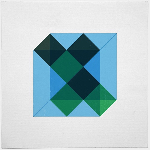


I like the way these illustrations defy depth or shadow through tone of colour. The image of house displays this nicely , differerent tones of green have been used to explore depth as the tone gradually gets darker as it moves to the ground and lighter in the sky. The pinapple image to the left, uses symmetry to reflect and tessalate the shapes. I like the way the pine cone has been created using colour tones as shadow making it look more realistic but still keeping in with the geometric styling . The texture and mild colour help portray a vintage look and feel. This is something I wish to experiment with when i come to decide on colour palettes and shading for my book cover.
No comments:
Post a Comment